New Look Inspired by Nature
This is a very special guest blog post from the designer creating the look inside new Trianon, Emily Basham-Hoelscher the Founder and Principal Designer at High Contrast Design House. You can follow her on Instagram @highcontrastdesignhouse
When I first met with Stacy, I asked her the origin of the name Trianon. She explained to me that it was named after Le Petite Trianon - the garden home at Versailles. She said that what she personally took from the name was the notion of a tree - a place that is relaxing and provides a protective canopy - and that long ago the shop employees had even nicknamed it “The Tri”. So I took that and ran with it.

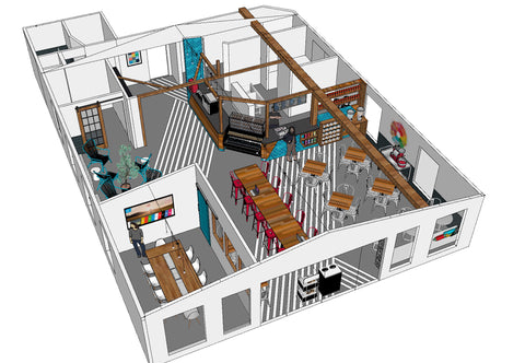
There are several distinct areas to hang out in the space:
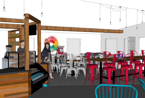
- The dining area is typical tables and chairs, to have a meal or a quick catch up with friends.
- The communal workspace is a bar-height table where you can work away on your laptop with coffee and a snack.
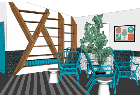
- The lounge is where you can come and truly relax - and moms can hang out while their kids enjoy the play area.
- And the group room is a private space for meetings and group discussions for up to 10 people.

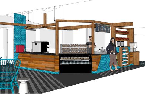
For the design concept, we wanted to use the inspiration of a tree, but in a much more graphic and abstracted way. The idea of the tree starts at the counter, with wood beams that stretch out like an abstracted canopy over the kitchen and across to the lounge.

At the lounge, the geometry of the branches meets the custom shelves for merchandise that have the appearance of abstracted trees as well. I added some geometric striping on the floor to connect the spaces and provide a visual path, and also to represent the shadows of the tree branches.

Concrete breeze blocks are used to emphasize all the graphic geometry, as well as provide great texture. They create a banquette seating area at the front of the shop, and create planters - where we will grow real coffee plants! - in the lounge.

We wanted to create a fresh brand color palette for the space - one that would be bright, modern, and fun. The gorgeous, handmade aqua tiles sourced locally from Clayworks represent the rain that feeds the tree, and the rounded shape is a great contrast the the geometric angles of all the wood. Aqua became our primary brand color, with the secondary colors being pops of red - representing the fire of roasting the coffee, green - representing the leaves of the tree and of the coffee plants, and orange - representing the sun.

This new space is a huge new start for Trianon, so we went BOLD while still making it a cozy space where you will want to just hang out for hours. I hope you love the new Tri-House!
Emily Basham-Hoelscher
Founder + Principal Designer
highcontrastdesignhouse.com

187 comments
I CANNOT WAIT! Miss you guys, but I have been getting my coffee fix delivered….you guys are AWESOME!
Opening date?